Testing
Monday, October 31, 2011
P-R-O-G-R-E-S-S ~ Floor Plan
Finalizing the floor plan layout, a few thing was added in the plan and some spaces have been rearrange. "What was added in the plan" ~ Doorways were added in the semi-private and the private zone to allow people access to the outdoor spaces. A plant room is also placed in the private zone, for the electrical and mechanical purposes. "What spaces have been rearranged" ~ the staff bathrooms have been reallocated to the corner as it was not a good idea to have the bathroom at the entrance of the private zone.
Sunday, October 30, 2011
P-R-O-G-R-E-S-S ~ Messing Model in Sketch Up
Elevation View:
1. showing the leveling of the roof structure
2. illustrate how the day light enter into the building
1. showing the leveling of the roof structure
2. illustrate how the day light enter into the building
P-R-O-G-R-E-S-S ~ Messing Model in Sketch Up
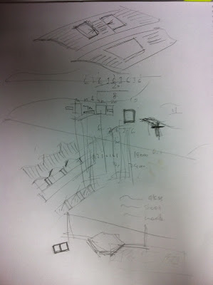
The roofs have been modified, more openings are added onto the wavy roofs, in order to allow better natural ventilation and day light access into the building.
Saturday, October 29, 2011
P-R-O-G-R-E-S-S ~ Exemplar
finding other solutions to add on to the wavy roof structure for better natural ventilation and natural light enter into the building. this is what i came across with.
Olympia 66, Dalian, PRC
Friday, October 28, 2011
P-R-O-G-R-E-S-S ~ Floor Plan (Modified)
The floor plan has been modified and a few things has changed after the discussion with the tutor.
1. stair: it has changed from the organic form to a regular pattern as i was having difficulty with combining the organic form stair with the wavy form roof, the two don't work that well when put together and it looks a bit messy so i decided to change it to the regular pattern instead. The regular pattern also suits better with the symmetrical design for the proposed building.
2. boundary: i have extend the boundary of the both side of the building outward and these new spaces can also become an open public space, which benefits natural light and ventilation enter into the building, to become more green and sustainable.
3. staff back office: it was added in the plan to provide a space for the staff members to relax during breaks and lunch time.
4. waiting area: the size of the waiting area has been reduce as it was too big in the previous plan which acted as waste space.
5. conference room: all four conference rooms have been increase in size in order to fit more people when its needed.
5. conference room: all four conference rooms have been increase in size in order to fit more people when its needed.
Wednesday, October 26, 2011
P-R-O-G-R-E-S-S ~ Exemplar
since i have decided to use the wavy structure for the roof, so i started to do some researches on wave roof or structure, these are the few photo i came across with
Sunday, October 23, 2011
P-R-O-G-R-E-S-S ~ Building Form
sketch 1
sketch2
sketch 3
___________________________________________________________________________
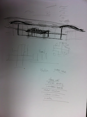
Compared to other designs that created, I have chosen a wave pattern design to form the roof. This interesting design allow natural sunlight and ventilation to flow into the building. The aim of this design is to symbolize "Leading to Final Resolution" of the decision making which needs to be discussed. As "Sketch 3" illustrates, the design of the roof is constructed by the shape of wave patterns, where smaller waves is formed and slowly rising to bigger and wider waves similar to the formation of waves seen on beaches.
During decision making process for issues or problems to be addressed each section of the roofs represents a vote from each group of the community to aim for a desired resolution. As the more preferred resolution is raised during each decision making process, the more votes it will get from the community, therefore, the stronger the outcome will be, as a result it will "Lead to Final Resolution" which the community will strongly support as a team.
During decision making process for issues or problems to be addressed each section of the roofs represents a vote from each group of the community to aim for a desired resolution. As the more preferred resolution is raised during each decision making process, the more votes it will get from the community, therefore, the stronger the outcome will be, as a result it will "Lead to Final Resolution" which the community will strongly support as a team.
Thursday, October 20, 2011
P-R-O-G-R-E-S-S ~ Building Form & Design
As the proposed building is provided for the public community to interact with the existing parliament committee rooms and members in order to discuses and solve any problems or issues that are currently rising, therefore all decision makings have to be fair,open and equitable. These three points give me some ideas of what elements the proposed building should be included.
Fair & Equitable = Symmetrical
Open = Open-able roof / Court yard / Glass wall
Tuesday, October 18, 2011
P-R-O-G-R-E-S-S ~ Building Form
connection between the three components
The new parliament house
The proposed site
The old parliament house
__________________________________________________________________________
i was still unsure of what form my building should look like so i took a few steps back and look at the design of the new and old parliament house, and i realized that the both parliament house are designed symmetrically, so i guess "SYMMETRIC" will be one of the elements i need to consider with my design as the proposed site is in between the new parliament house and the old parliament house. Otherwise, the proposed building would shown to be a "SINGLE" building but not a "WHOLE" which appears of lost the connection between the three components(the new parliament house, the old parliament house and the proposed building.
* SIDE NOTE: If "SYMMETRIC" is the direction i am heading, it is necessary to reconsider the form of the stair case to be more a regular pattern other than a organic form which it is currently
Sunday, October 16, 2011
Subscribe to:
Comments (Atom)


